Landing page redesign · AI software
A landing page that shows its receipts
CorpusIQ makes ChatGPT, Claude, and Perplexity answer from your business data, with the source of every number. That promise is hard to believe until you watch it happen. I kept every claim the team had written, rebuilt the order and the motion, and put an answer demo right under the headline. It is now their live home page.
- Role
- Structure, design, code, copy edits
- Stack
- Hand-coded HTML, CSS, JS
- Year
- 2026
- Status
- Live
Next for their site
Menus that move with you
The next motion pack for corpusiq.io: menus that slide and morph, cards that lean toward the cursor, an exit pop-up, and a new Microsoft Azure partner page. Recorded from my build.
What I built
Written, designed, and coded by hand
- An answer demo right under the hero: the question types itself, a small dashboard builds, and a hand taps the source to show where the number came from
- A different layout for every section, so the page keeps a rhythm as you scroll
- The problem and the why in one section, with every point kept
- All 44 connector logos in one scrolling band, so a visitor can check their tools in seconds
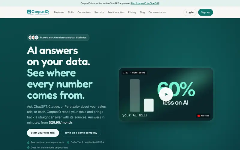
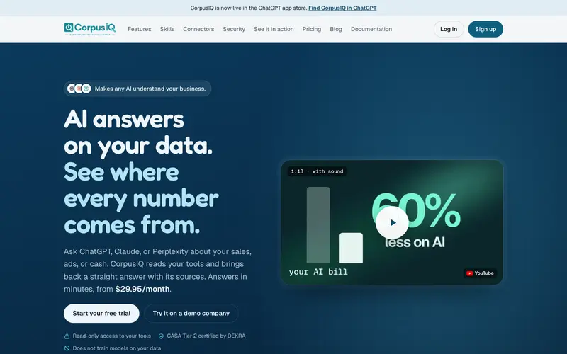
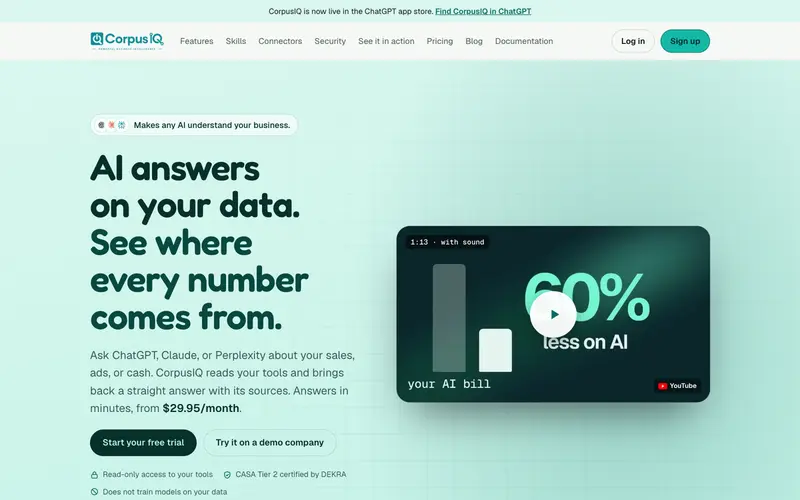
- Three teal directions for the founder to pick from, with body and button text checked for contrast
- Hand-drawn notes that draw themselves: the big-company way crossed out, a "receipts!" circle, a coffee mug for the Monday brief
The brand kit
Their teal, three ways
CorpusIQ's own teal and type, kept. I added a hand-drawn font for the notes and three teal directions for the founder to pick from. Every color below is read off the page's CSS.
Palette
Type
- Fredoka Display · 600
- Geist Body · 400 / 600
- Geist Mono Labels · 500
- Gochi Hand Notes · 400
Motion
One moment does the explaining, and small ink does the rest. The demo types a question, builds the dashboard, and a cartoon hand taps a source. Doodles draw once as you reach them. The logo band scrolls and stops when you hover. With reduced motion, everything holds still and stays complete.
The whole page
The whole page, top to footer
Scroll inside the window below. This is the full page as I built it, captured at full height.


On a phone
Built at 390 pixels first
Every section is drawn on the phone before it is drawn on the desktop, then opened up. Most of your customers will only ever see this version, so it does not get the leftovers.
Three directions
Three teal directions to pick from
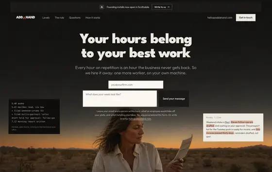
Want one like this for your business?
Book a time and tell me what your business does and what your current site is not doing. On the call, I tell you what I would build.